Visual Examples
Below is the site's social preview image and detailed descriptions of each section. For live visual reference, visit christophershiersdigital.com
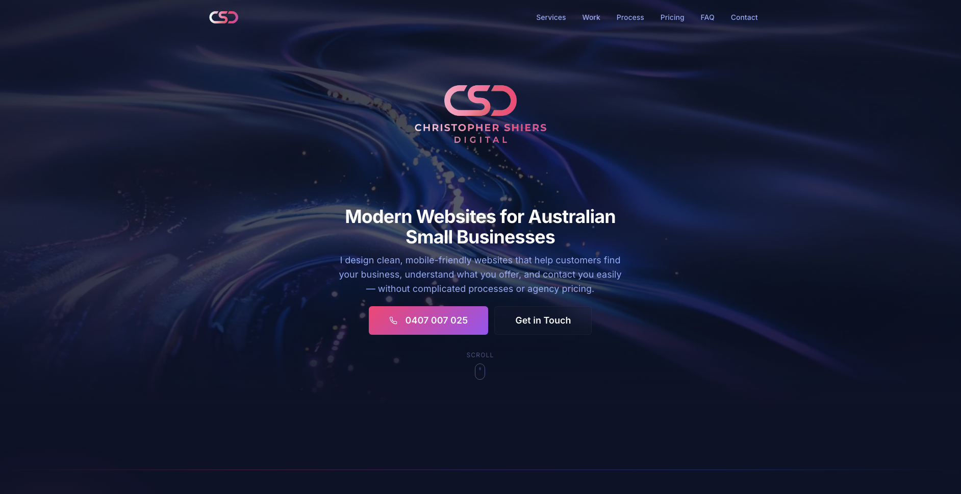
Site Preview Image
Social Preview / OG Image
Shows the brand's dark navy aesthetic with the signature pink-purple-blue gradient accent.
Page Sections (Visual Descriptions)
Hero Section
Layout: Full-viewport height with looping video background (abstract flowing gradients). Semi-transparent dark overlay.
Content: Large white headline "Modern Websites for Australian Small Businesses" centered. Soft indigo subtitle below. Gradient CTA button.
Visual Feel: Immersive, modern, professional. Video creates subtle movement without distraction.
What I Do Section
Layout: 3-column grid of service cards on dark background.
Cards: Subtle glassmorphism (very low opacity), icons with gradient treatment, white headings, soft indigo body text.
Services Listed: Custom Design, Mobile-Friendly, Fast Turnaround
Portfolio Section
Layout: Grid of portfolio screenshots with hover effects.
Cards: Image thumbnails with rounded corners (12px), dark card backgrounds, client names below.
Visual Feel: Clean gallery showcasing real work examples.
Pricing Section
Layout: 3-column pricing cards, center card highlighted.
Featured Card: Full glassmorphism treatment with animated gradient border/underglow effect.
Other Cards: Subtle glass style, clear pricing ($999, $1,499, $79/mo), feature lists with checkmarks.
Process Section
Layout: Numbered steps (1-4) in a timeline-style layout.
Visual: Numbers use gradient text treatment. Clean, scannable format.
Steps: Chat → Design → Build → Launch
FAQ Section
Layout: Accordion-style expandable questions.
Visual: Clean borders, smooth expand/collapse animation, soft indigo answer text.
Contact Section
Layout: Contact form with glassmorphism card background.
Form Fields: Name, email, message. Gradient submit button.
Visual: Clean input fields with subtle borders, focus states use blue accent.
Footer
Layout: Simple centered footer on dark background.
Content: Logo mark, copyright, minimal links.
Visual: Understated, professional close to the page.